Atom Bank
Industry: Digital only bank
Role: Senior UX Designer at TH_NK (digital agency)
Project team size: 3
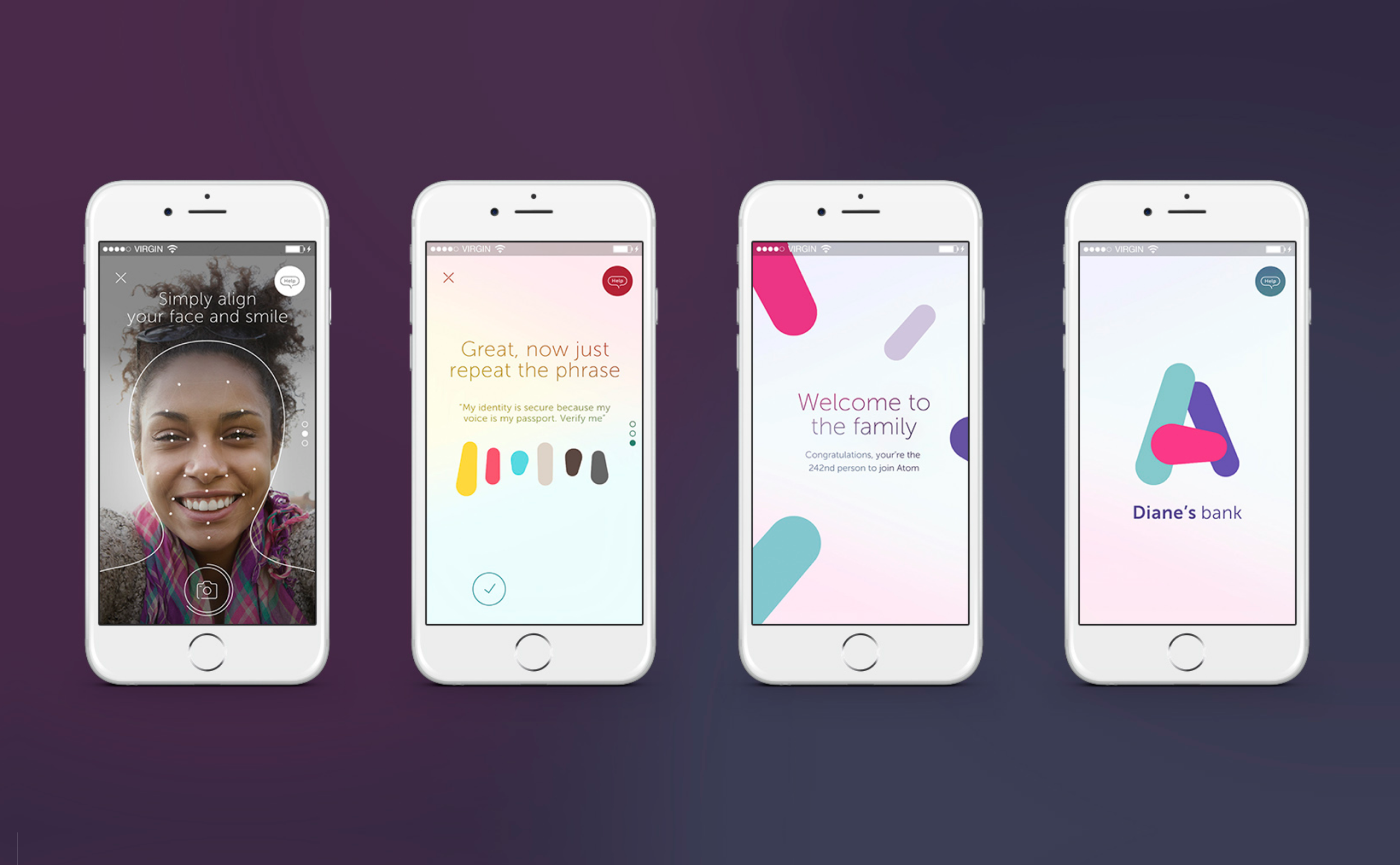
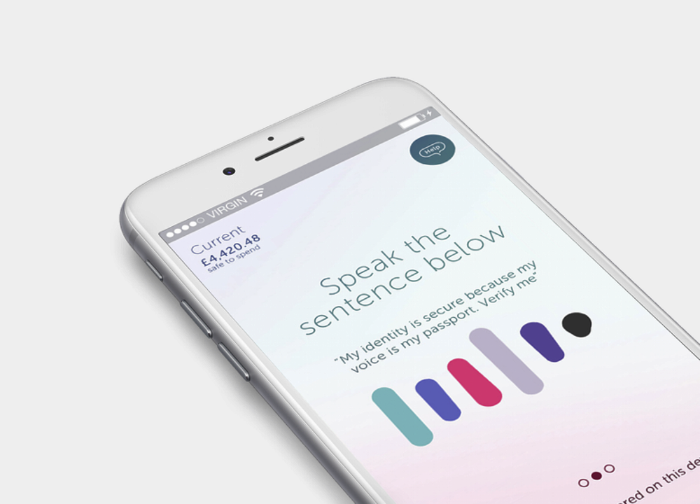
For 9 months I was one of 3 senior UX designing the UK’s first digital only bank. From proof of concept, to design principles, user research and testing, we challenged and pushed every aspect of the banking experience to re-imagine it for the 21st century consumer. Once the initial POC and designs were in place, I joined Atom’s banking team on site and took responsibility for designing the onboarding flow and in app messaging, working with SMEs, developers, and technology partners to make it a reality.
Challenge everything
At the time, Atom was the UK’s first digital native bank. Without a network of physical branches or staff, it had to convince the British public that it could be trusted with their most sensitive financial needs, and, differentiate itself in every meaningful way from long established high street incumbents.
The brief was clear: reimagine banking for a digital first context. From brand and interactions to core functionality, everything needed to be distinct, dynamic, and designed from the ground up.
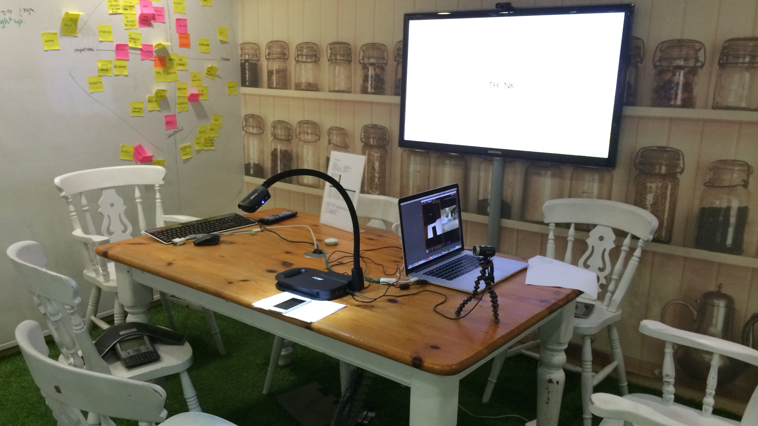
The first month took the form of an intensive “design camp”, with the client embedded in our team. Together, we defined the product vision, established a distinctive identity, and set the guiding principles for all subsequent design and delivery.
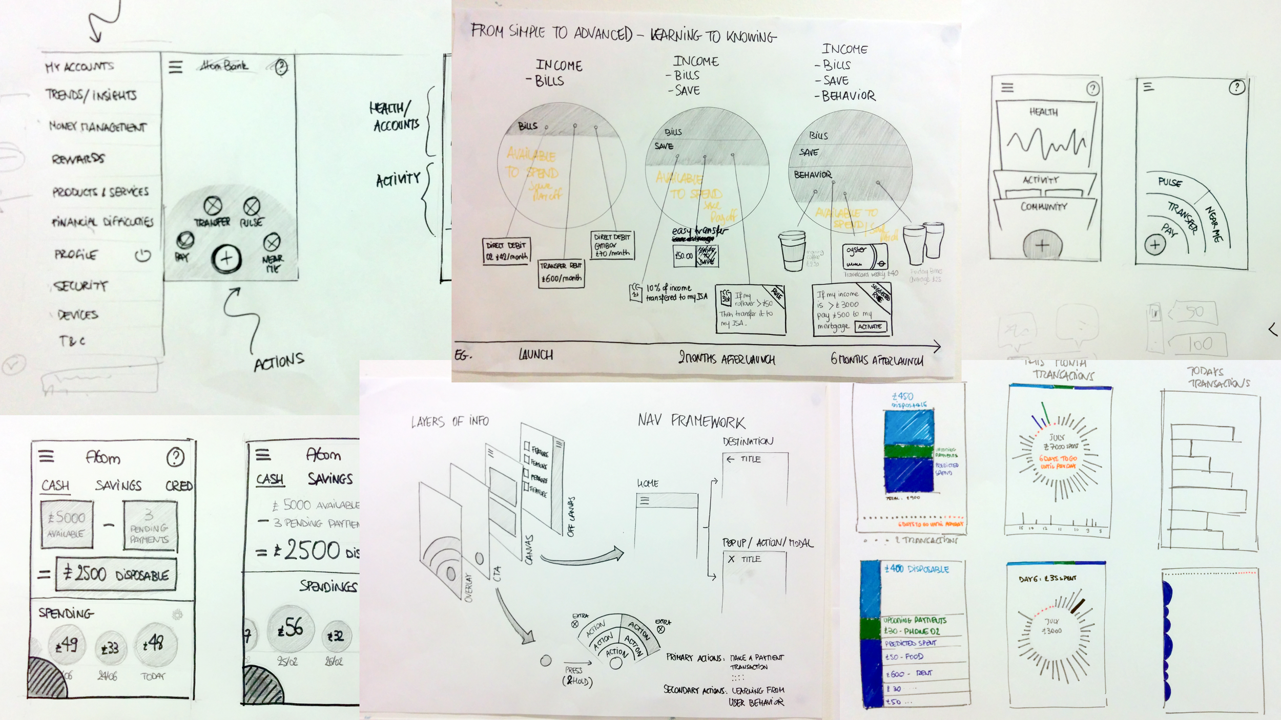
What would your bank look like?
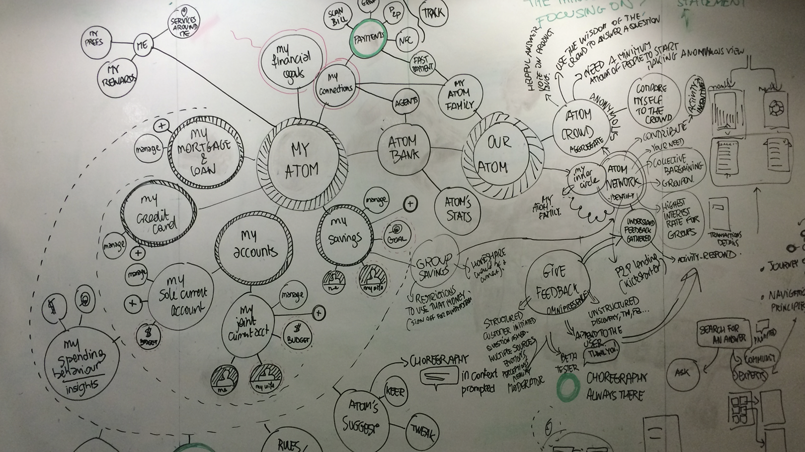
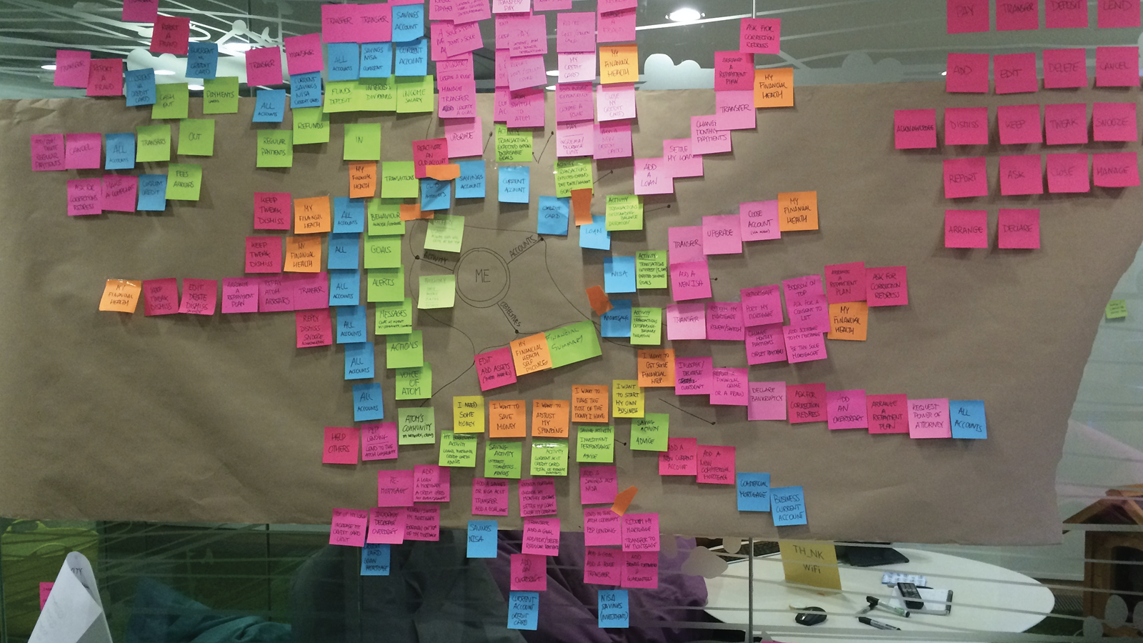
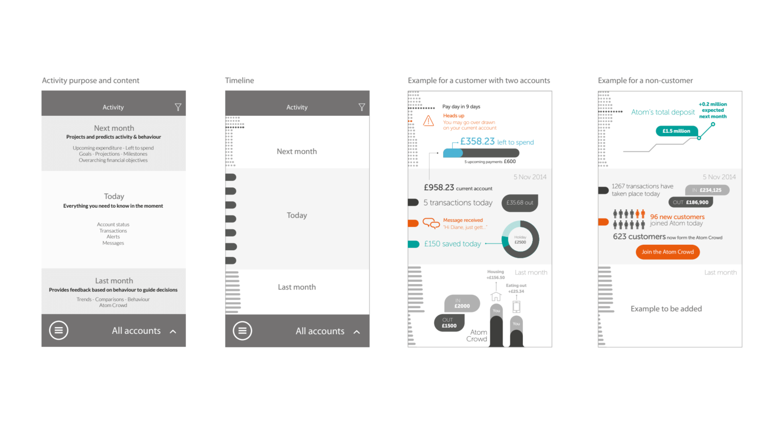
In terms of research we began by exploring how customers would design their own personal bank: what mattered most to them, and how they would want to access it. The last thing a remote bank could afford was to feel distant from its users. We initially used traditional card sorting, but early sessions showed that participants simply recreated familiar structures from existing banking websites.
In response, we shifted approach. We asked people to prioritise features by placing them in concentric rings, with themselves at the centre, based on frequency and importance of use. This produced a more flexible, user-shaped information architecture, one that reflected the idea of a truly personal bank, ‘the bank in your pocket’, organised around you.

Validation
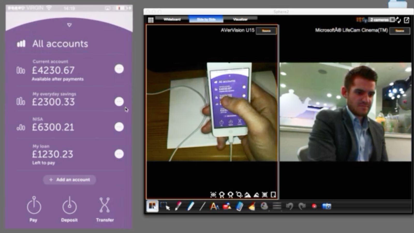
Once the initial design direction was established, we tested a prototype across phone and tablet with five customers. The response to the brand, aesthetics, and UX was overwhelmingly positive. Users recognised the app as a step change from traditional banking systems, one that brought an “Apple like” focus on quality, personalisation, and a frictionless user experience.
“The quality of the aesthetics and interactions tells me something about the company, what its aspirations are, and what it’s trying to do for its customers. ”
Preparing for delivery
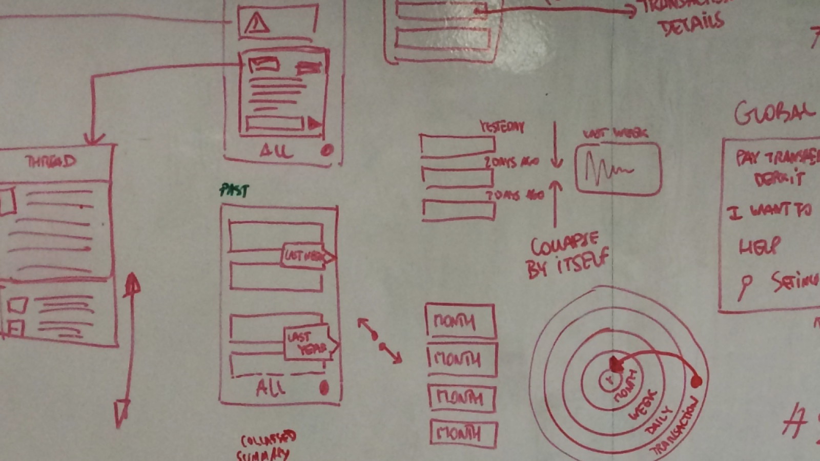
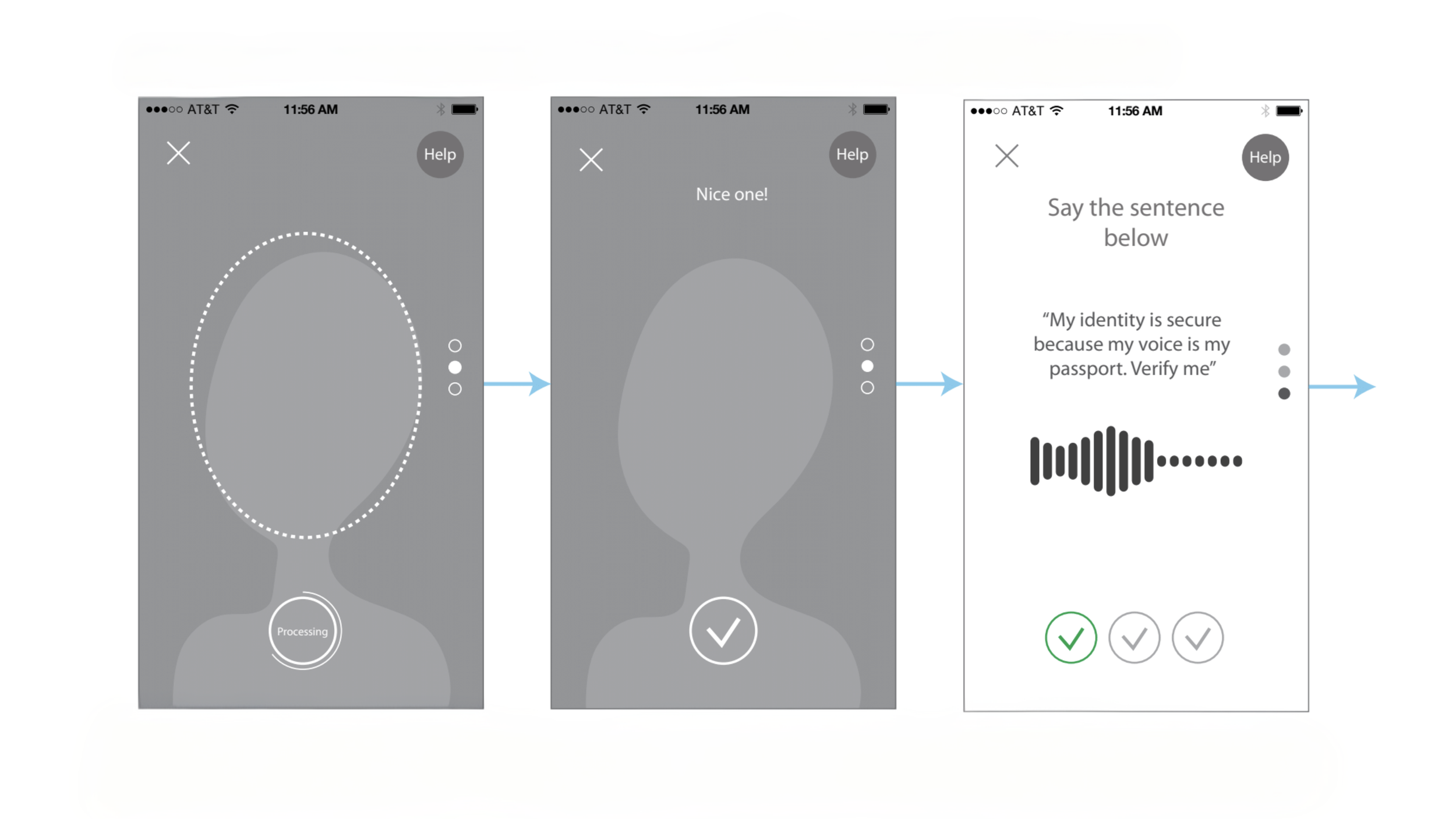
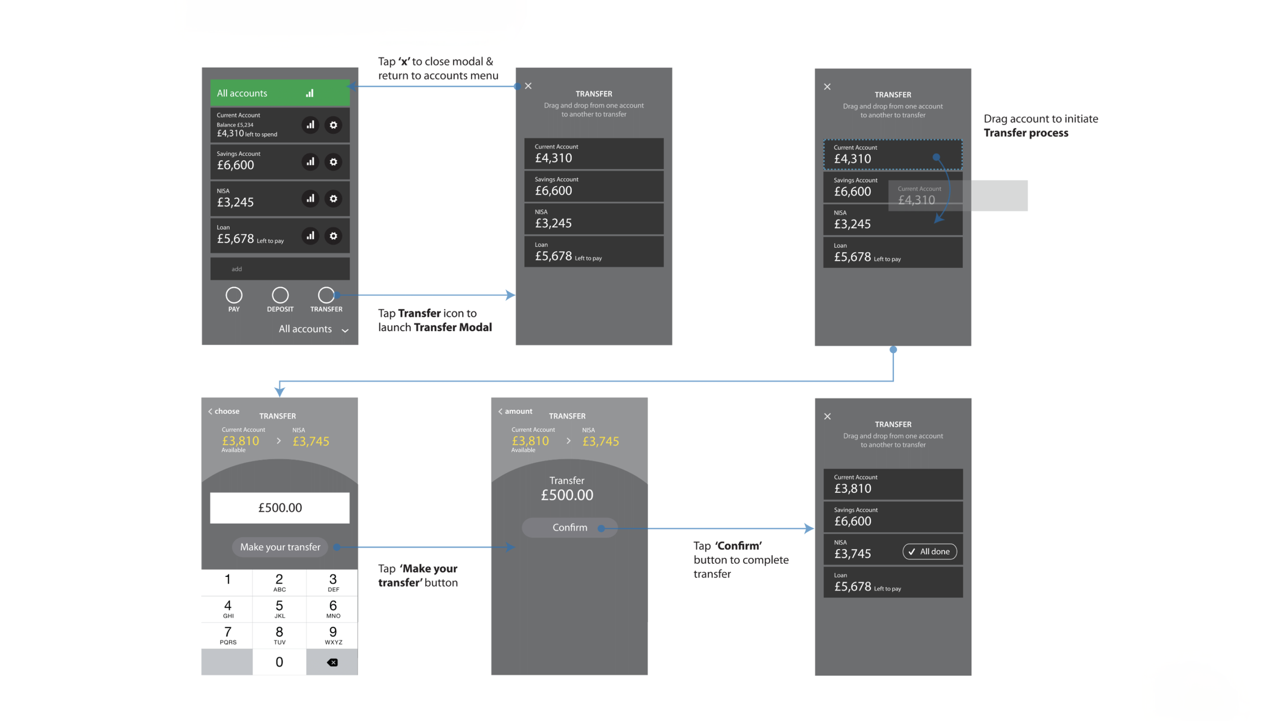
With the high level design and UX principles set, we began detailing the core user flows, screens, and information architecture. This phase was about translating vision into a usable product, refining interaction patterns, and ensuring consistency across the experience.
Execution
I spent the final six months of the project on site with the client as they built out their internal team of designers, developers, and SMEs. A key challenge during this period was ensuring that, as new stakeholders and technology partners came on board, the ambition of the brand and product was not diluted by the practical realities of delivery. This was achieved through constant advocacy and by repeatedly grounding decisions in the original product vision and design principles.
Results
Atom has since established itself as a respected digital banking brand, with over 67,000 accounts opened, an average 4.7 rating in the App store, and an excellent rating on Trust Pilot. In 2019, Atom ranked second in Beauhurst’s list of the UK’s top 50 fintech startups and scale ups.
More broadly, the product demonstrated that a fully digital bank could deliver a high quality, trusted experience at scale, validating many of the design and experience principles established during the project.